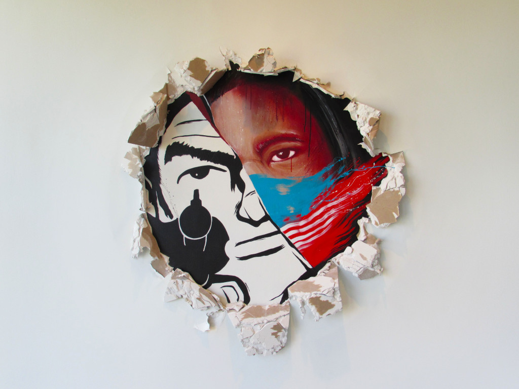
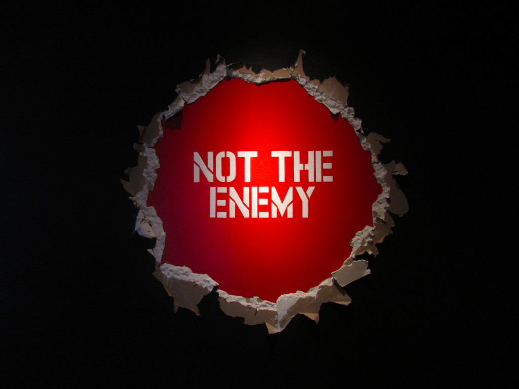
As you walk up the stairs to the second floor of LBMA (@lbmaorg) to continue your tour of “Vitality and Verve: Transforming the Urban Landscape“, the first piece you will encounter is an untitled installation by Meggs (@houseofmeggs) of a familiar gun range target character bursting out the wall as if he had just shot a bullet through it. If you look closely at the wall in person, you can see where Meggs plastered the wall to create this effect. If you walk behind this wall, you will meet the gunman in full view, except now you will notice that he is in fact NOT holding a gun, but rather a spray can. This is a huge distinction that I did not catch the first time I visited.
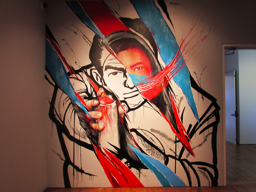
If you look behind you now, you will read the message “NOT THE ENEMY”. This seems to be directed at Long Beach Police Department for the shooting and murder of a local teen vandal, Hector Morejon, the same Hector that Saber refers to in his “Too Many Names” mural that is on the first floor, directly below the Meggs installation. The police had mistaken his spray paint can as a firearm, “I thought I saw a gun.” Should officers be allowed to be so careless? Meggs answers that law enforcement officers view potential criminals as target practice, but when you start to peel that away, they should be horrified to find a real person behind it.
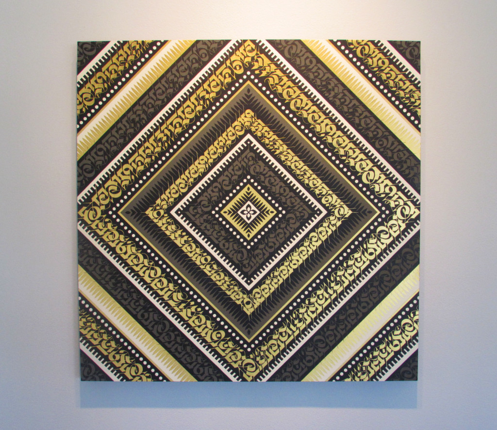
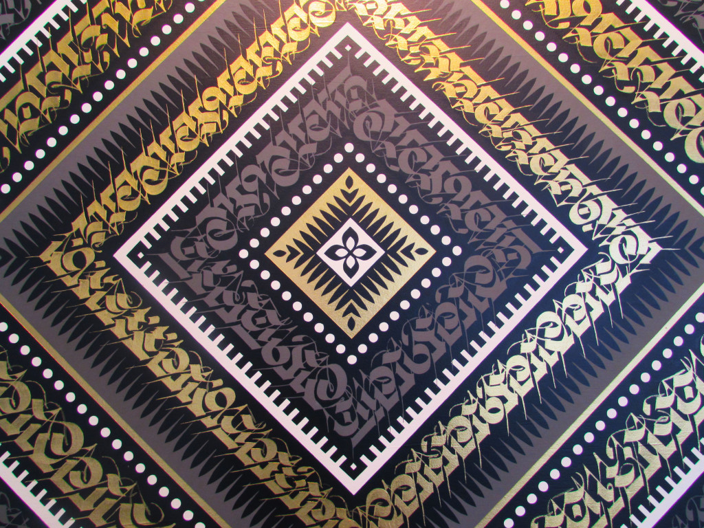
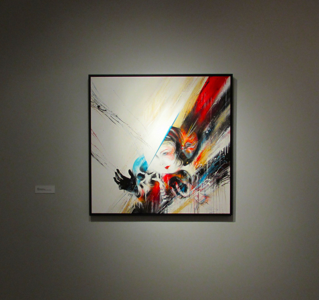
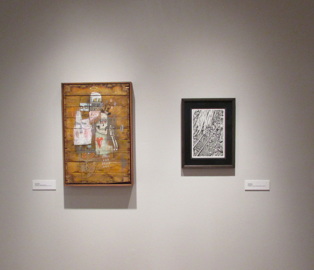
Well, that was a dark commentary so let’s keep moving. Next to the wall of your first encounter with Meggs’ installation is an acrylic on wood panel by Cryptik (@cryptk). Looking at Cryptik’s work sometimes frustrates me because I really want to know what it says. Anyone else feel like this?
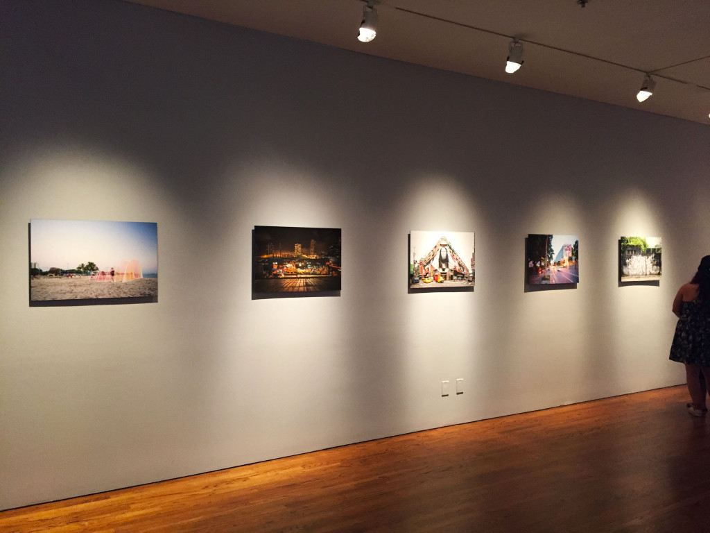
In the same room as the Meggs installation is a photography installation by Brandon Shigeta (@bshigeta), who also happens to be an architect.
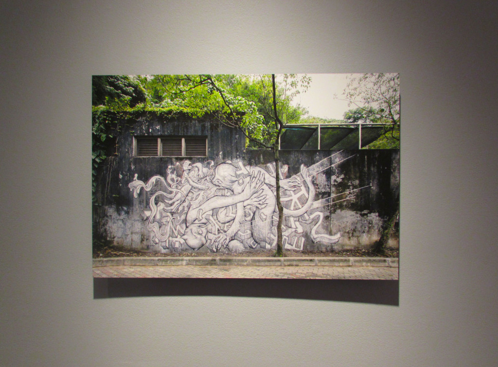
In the adjacent room is a large wall mural by Nosego (@nosego), who has become a rising star of the Thinkspace Gallery family. He has a show currently at the gallery, “Along Infinite River“.
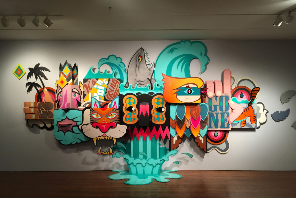
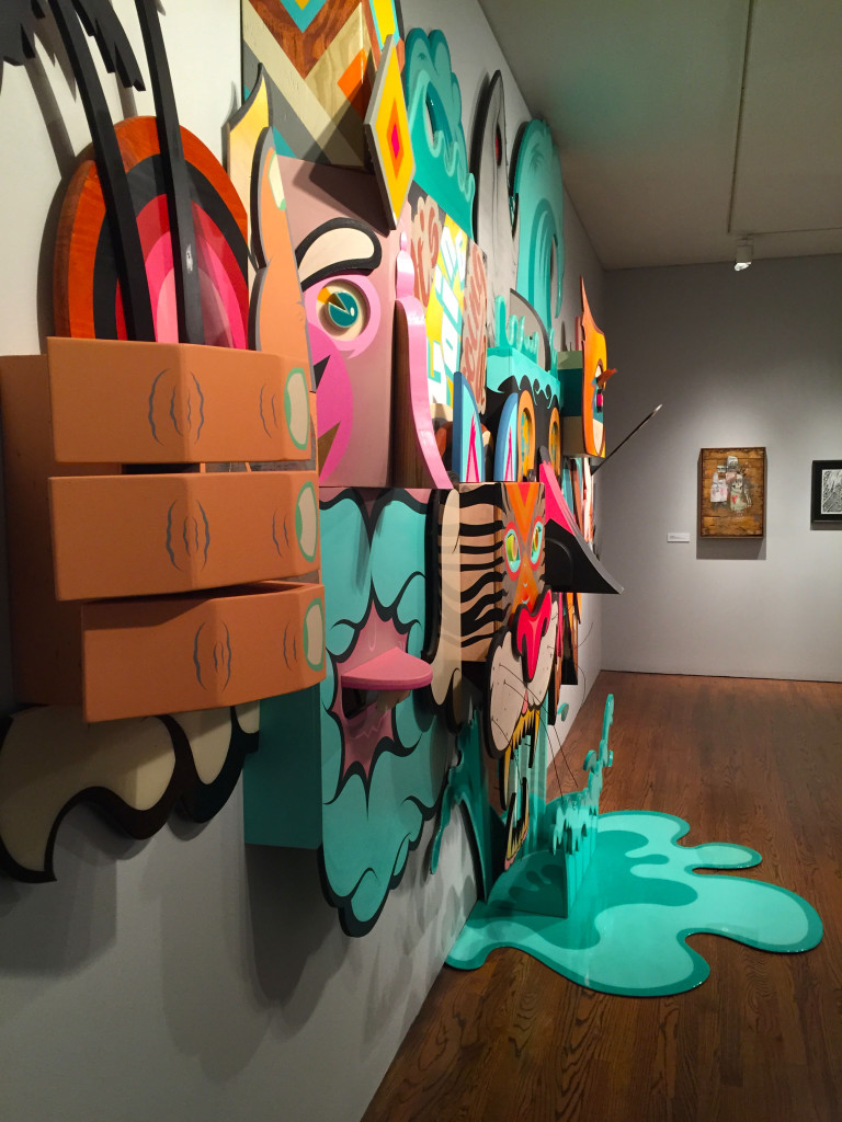
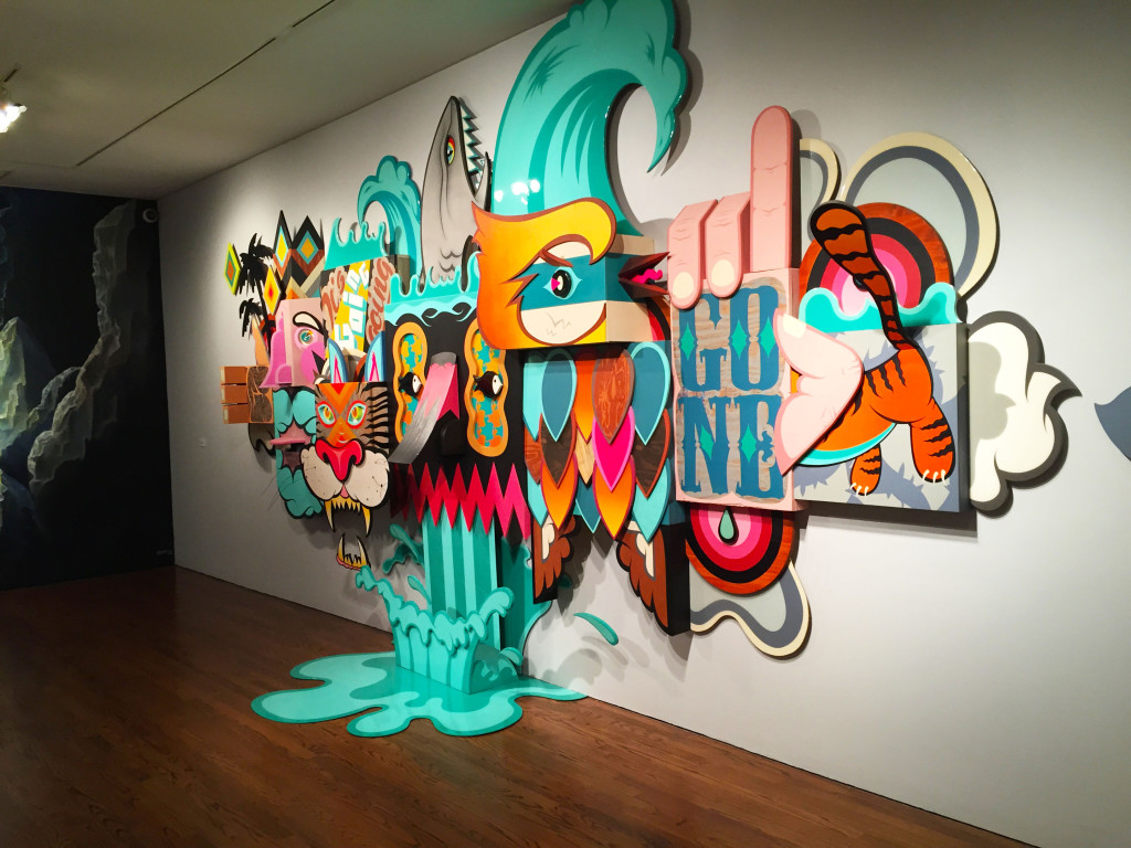
This Alex Yanes installation is freakin’ fun-tastic. It’s got a shark in the waves, a tiger, palm trees, birds; just looking at it make me feel refreshed.
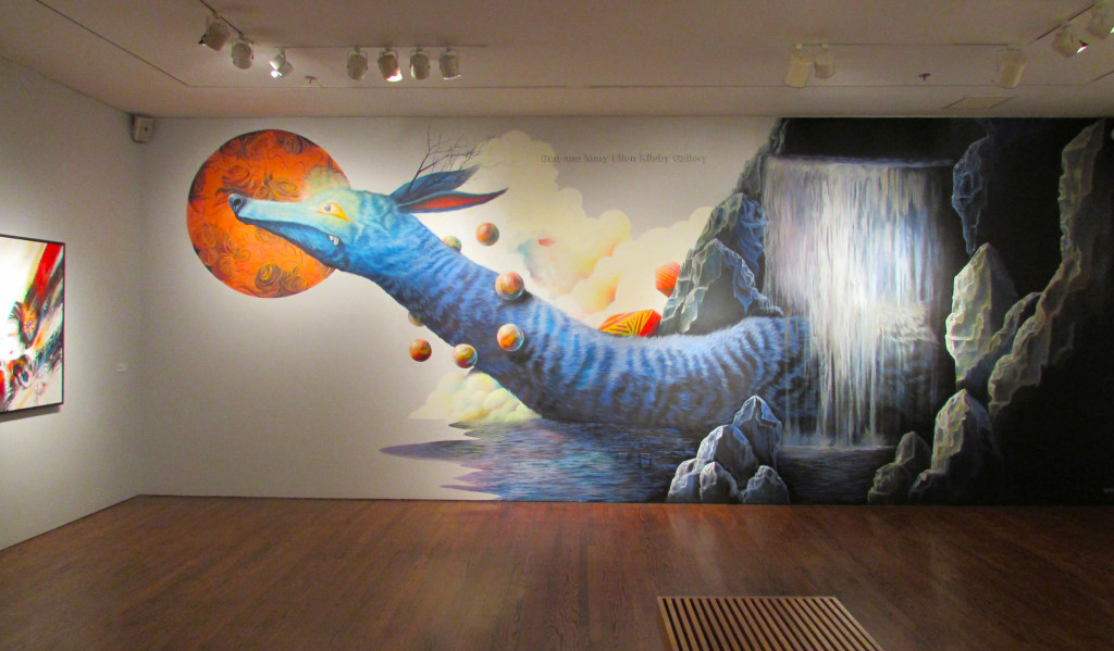
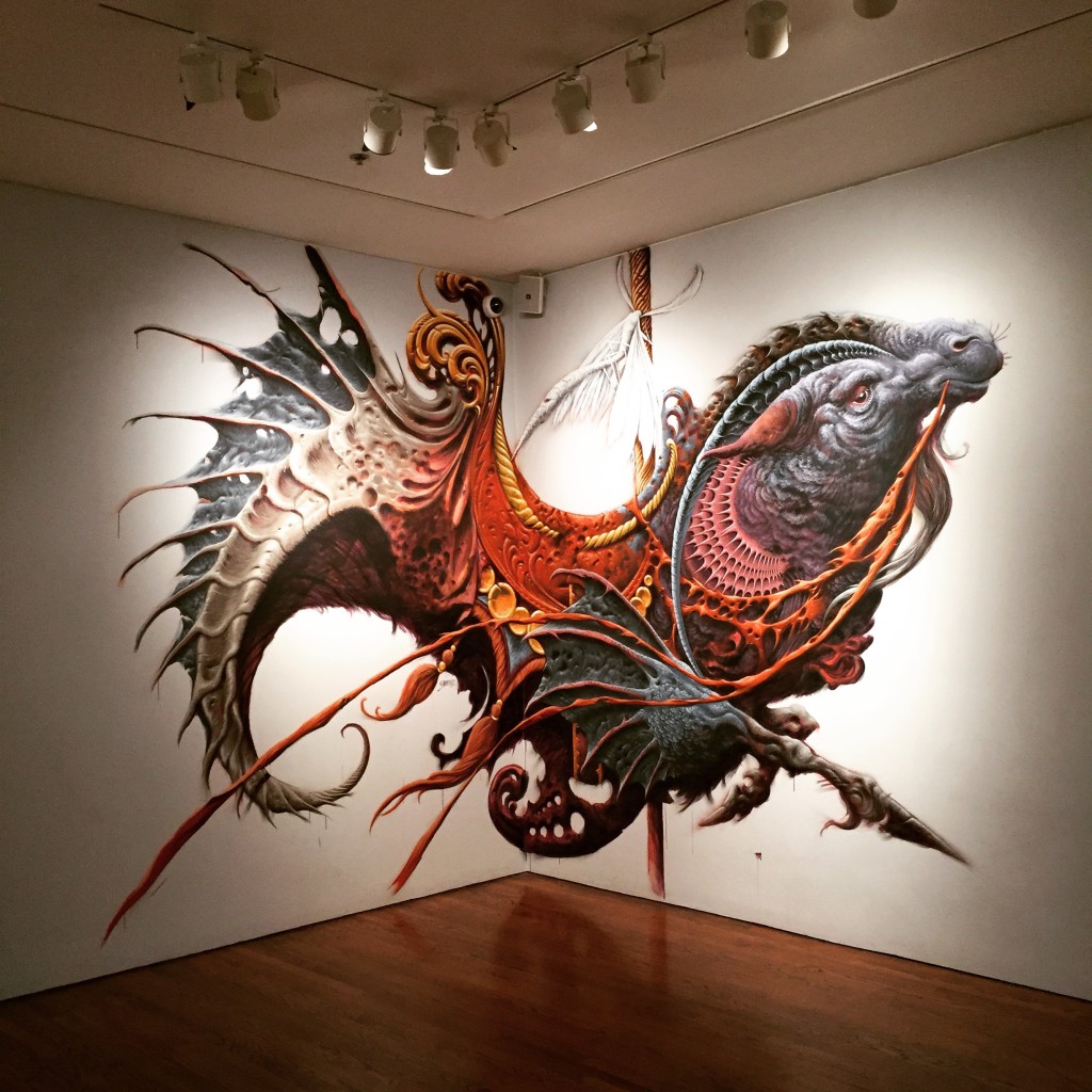
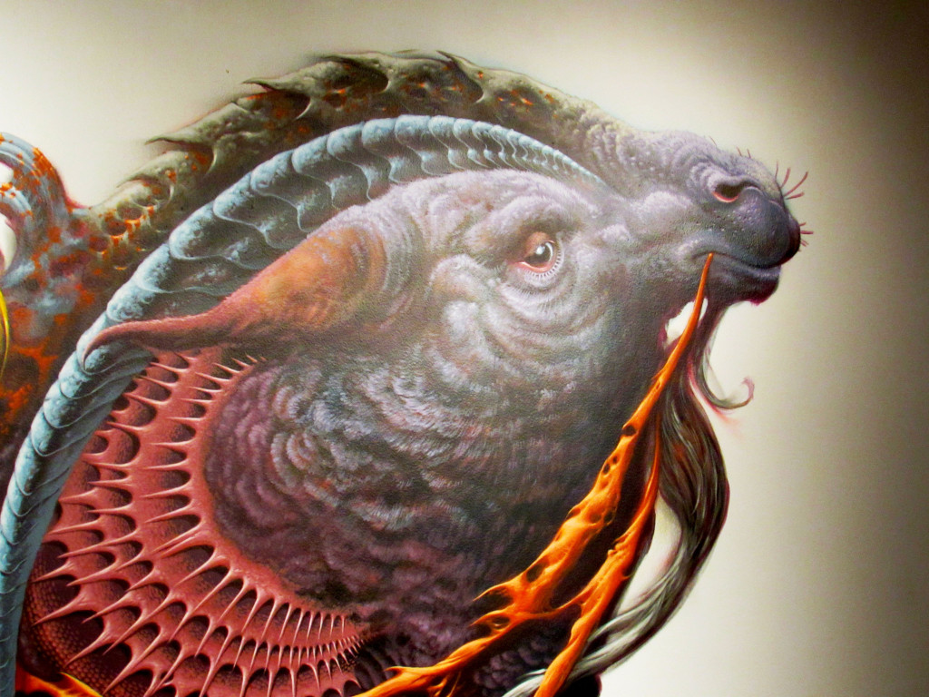
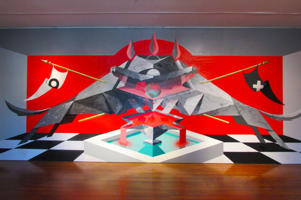
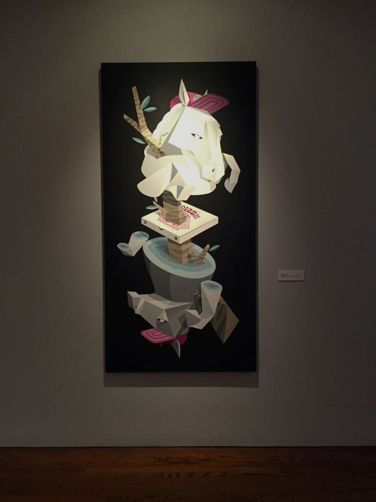
The real star of the room resides in a modest corner by the master painter/illustrator Aaron Horkey (@aaronhorkey). This chimera of a fantastical monster confuses, disgusts, and amazes me all at the same damn time. So I did some research (aka look up on Wikipedia) and this beast is a literal depiction of Capricorn, with a “head and body of a mountain goat, and the lower body and tail of a fish“. He has an empty saddle, so perhaps he is wandering the universe looking for his lost master.
In the next room the first mural you see is Jeff Soto (@jeffsotoart)’s contribution, “The Stars at Night”.
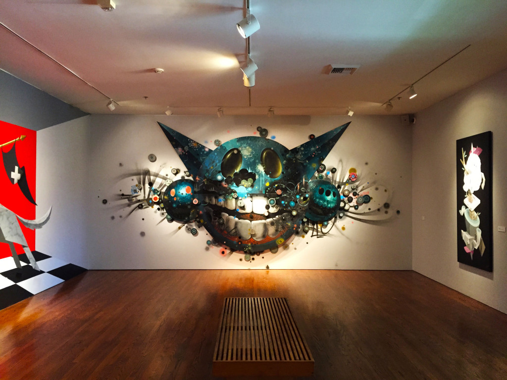
Then, of course, there are the Low Bros mural and an acrylic on canvas piece by the brothers as well.
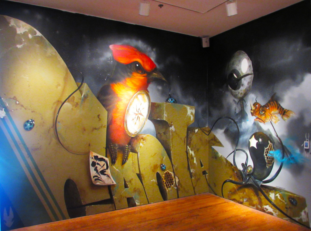
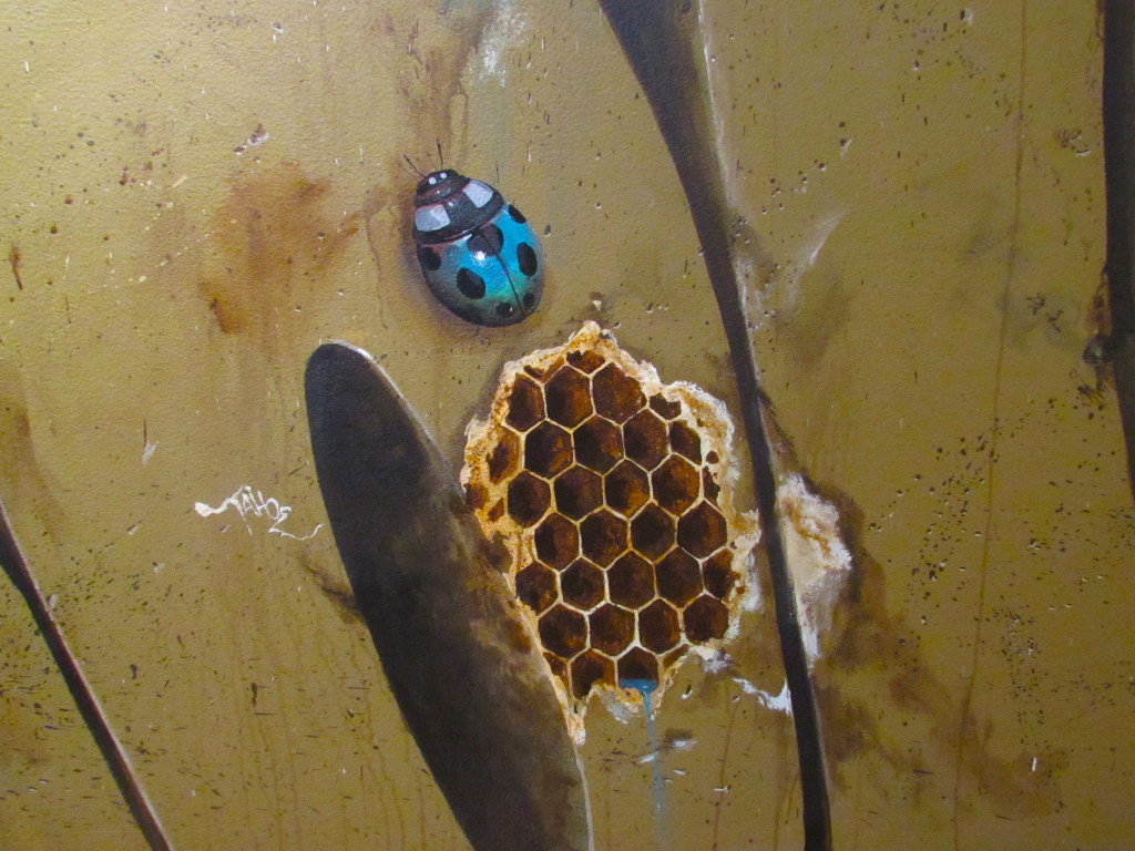
Greg Craola Simkin (@craola)’s wall is directly behind the Horkey wall. Craola’s affinity for birds is well known and the huge presence of the red bird makes it obvious for those that didn’t know already (Does anyone know what kind of bird that is?). This wall is also a throwback to Craola’s graffiti writer days with the huge “Craola” tag taking up most of the wall and a rather humorous take at that. Notice the “R” in “CRAOLA” is made to look like it was painted on a post-it note, as if he had misspelled his own name the first time.
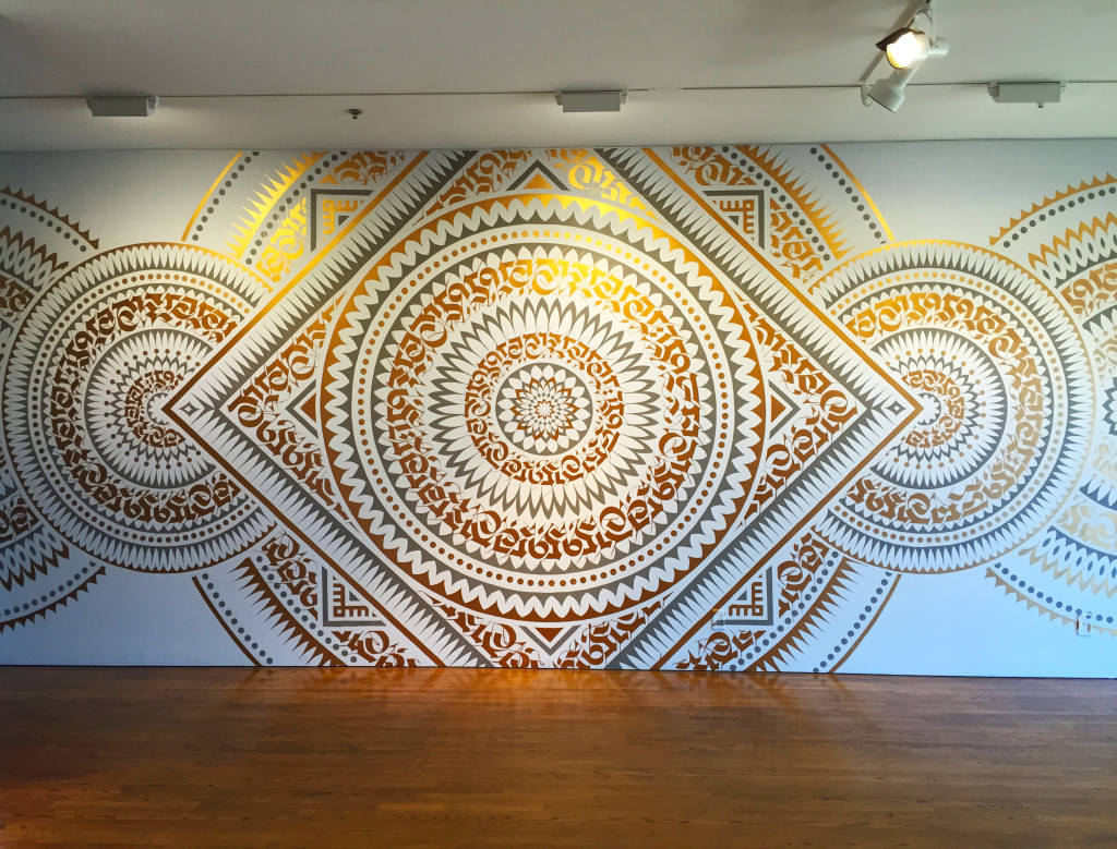
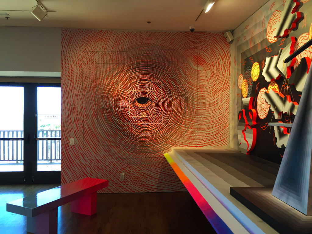
The Oceanview Gallery is the last gallery room in the exhibit, but by far from being the least room in the exhibit. Cryptik’s mural seems to be a continuation of the “Alboni Temple” motif found in the Pow! Wow! Long Beach mural event.
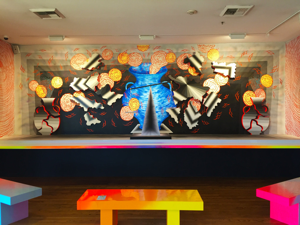
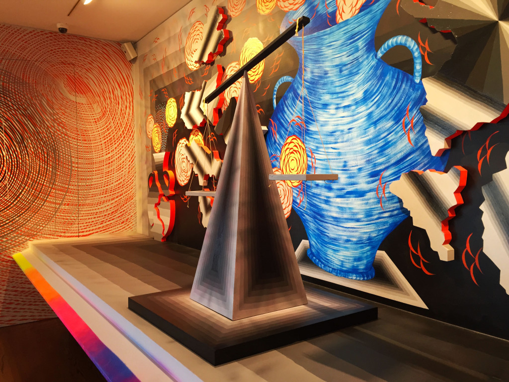
Across from the Cryptik is Andrew Schoultz’s 3D installation “Explosions, Bursts, and Breakage” complete with neon colored benches to enjoy the view.
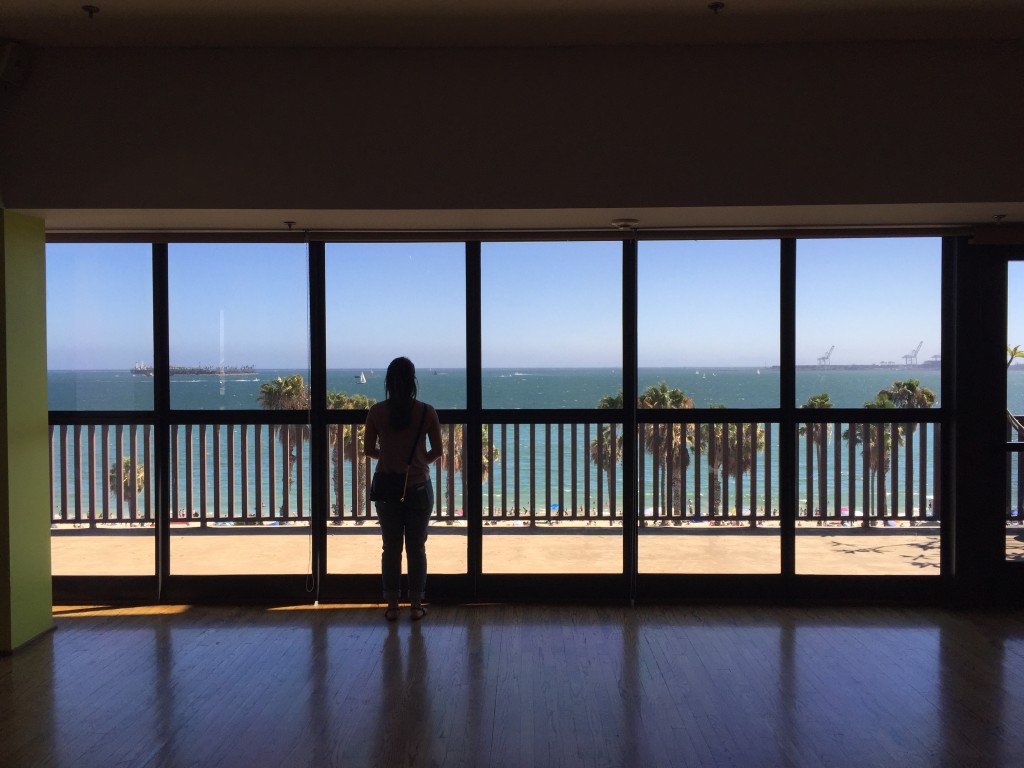
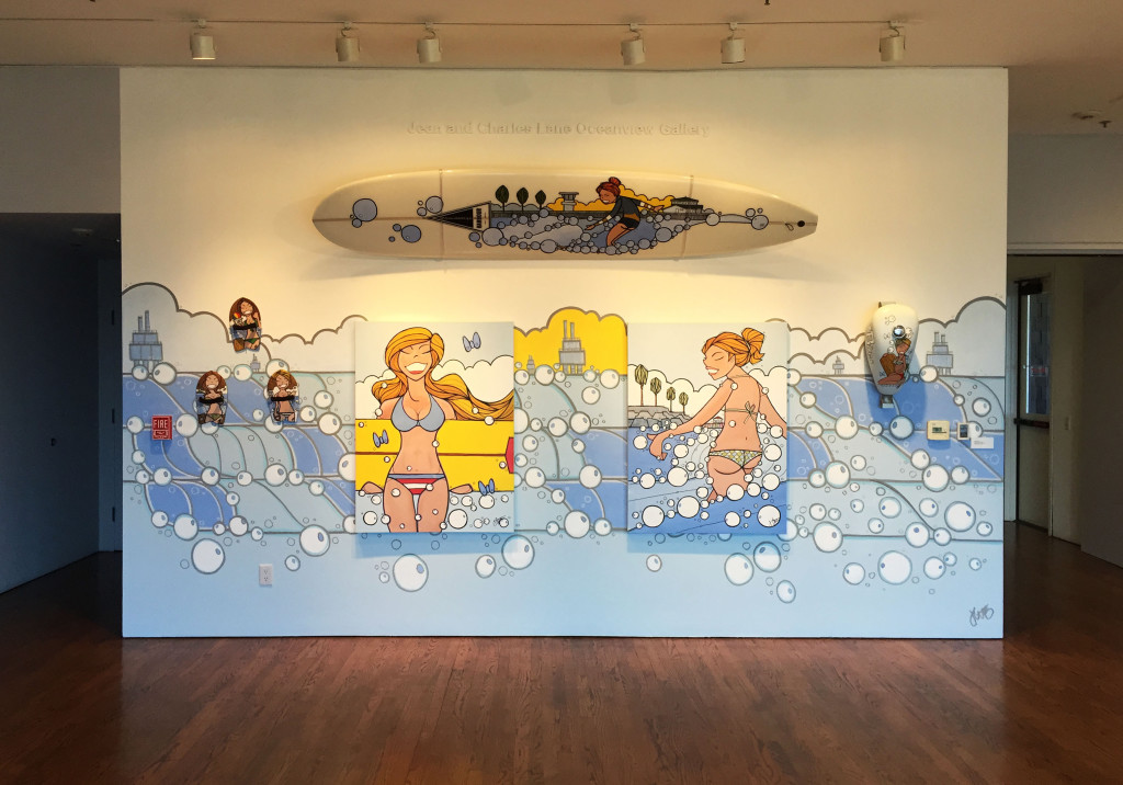
The theme of this last mural by John Culqui is very fitting because directly across from it is a balcony which directly looks over the beach.
Did this show succeed in what it set out to do? Ronald Nelson of LBMA wrote that he wanted to “[challenge] many of the conventions of paintings usually found hanging in a traditional and unsuspecting museum setting.” Fire extinguisher tag? Check. Gunman shooting through a wall? Check. Two street artists collaborating from different countries collaborating on a wall? Check. For a relatively small museum in a not-so-resourceful city such as Long Beach to put together a show like this would have taken a lot of effort. It certainly wasn’t as groundbreaking as “Art in the Streets” at MOCA, but it is beyond what I would have ever imagined possible here in a small museum like this.
I’m glad to see minor and even major museums accepting and, more importantly, trusting new contemporary and street artists with stewardship of their walls. This is a really good time for us to be in.
